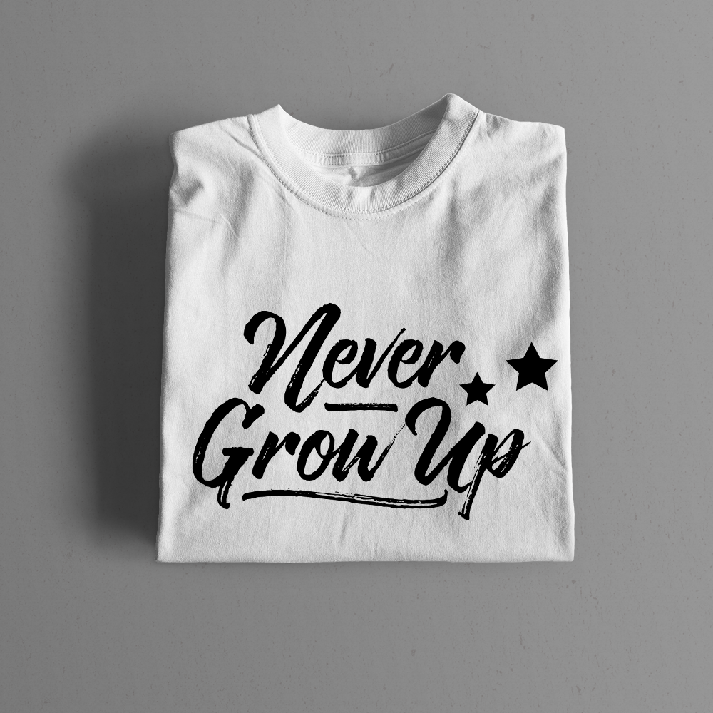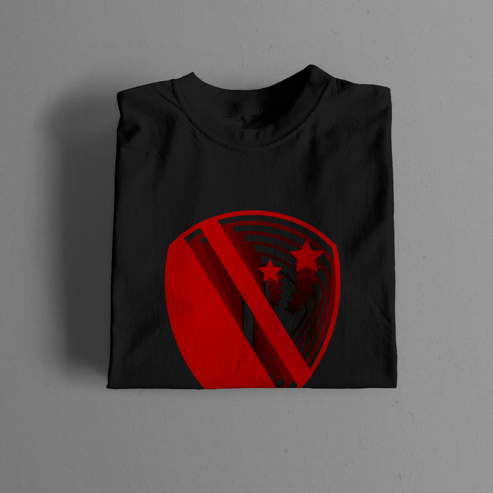
Logo, branding, and merchandise created for The Lost Boys Quidditch Club.
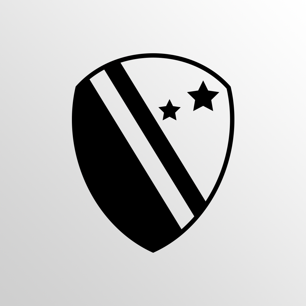
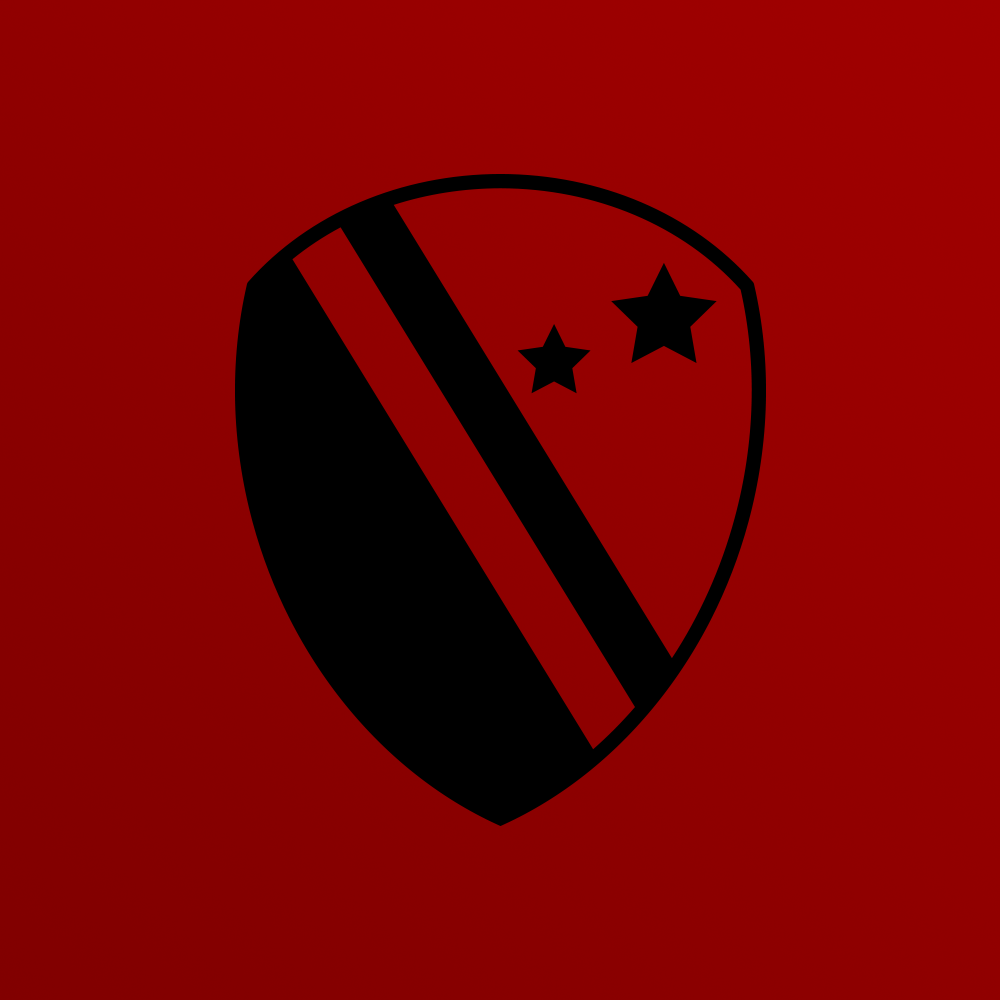
The team's namesake and color scheme is derived from the Lost Boys of the 1991 film, Hook. The logo itself is rife with Peter Pan imagery. The shape of the logo as a whole is reminiscent of an acorn; a gift that Peter gives Wendy to represent a kiss. Inside the crest are two asymmetrical stars and a diagonal stripe. These represent the ever iconic directions to Neverland, "second star to the right and straight on 'til morning."
The Lost Boys were awarded the US Quidditch's first ever Brand Excellence Award.
"The Lost Boys have created a brand that carries a weight in the community that places it among the best, if not the best,
in the sport."
in the sport."
The Quidditch Post
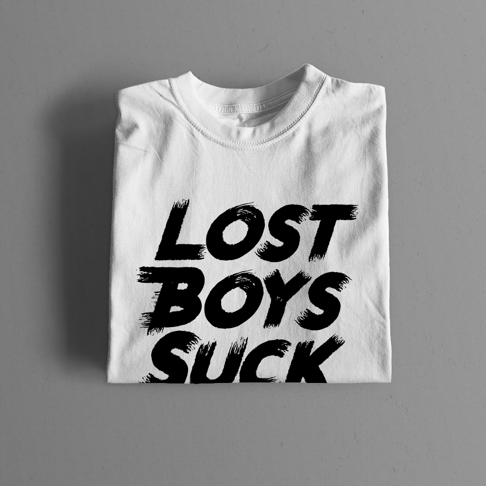
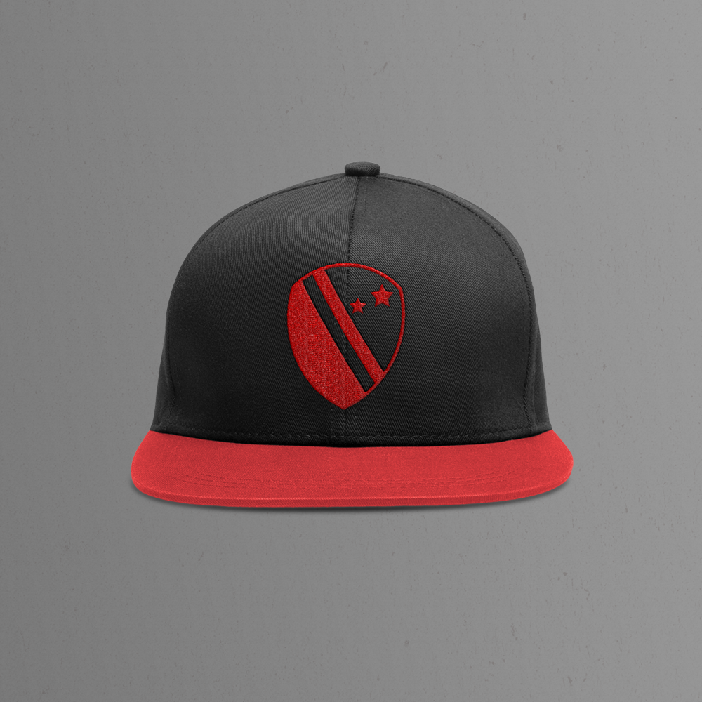
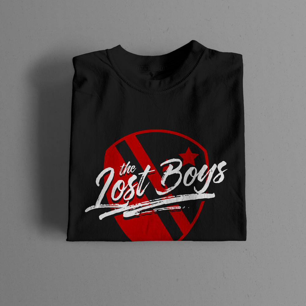
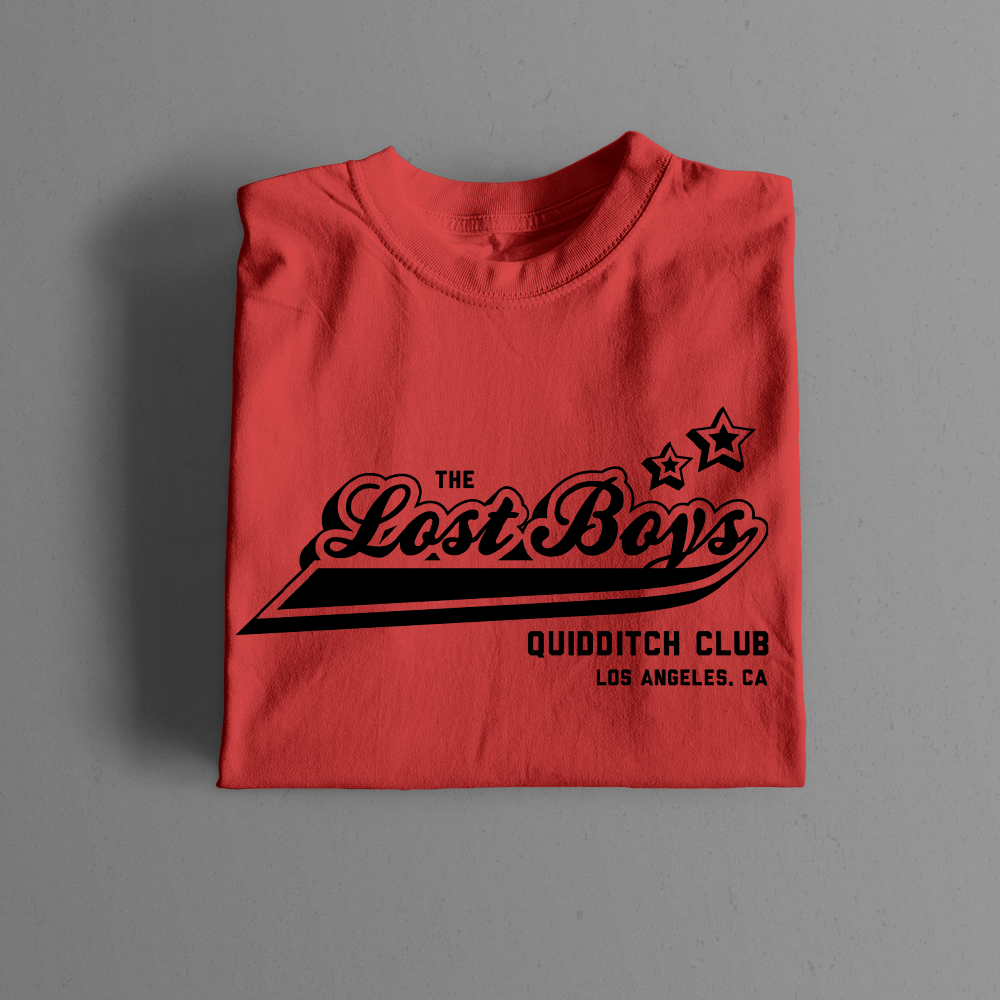
"The Lost Boys are a success story in gameplay as well as in the branding of their team. The simplistic and bold style of their crest, slogan, jerseys, and merchandise are all immediately recognizable and extremely well-coordinated."
The Quidditch Post
